Supply Chain Dashboard
Using a Supply chain data set obtained from kaggle I constructed fact and dimension tables in Microsoft SQL server. ETL was done in Power Query. Subsequenty A STAR Model was built in Power BI where I also formed relevant dax measures to create this dashboard.
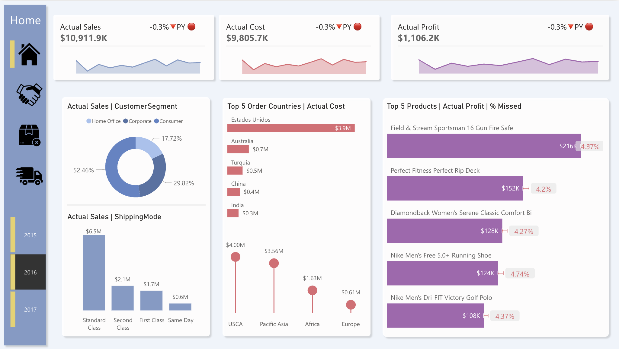
Home Page:
- The Home page comprises of KPIs pertaining to actual values for sales, cost, and profit from 2015-2017. The word “actual” is used as some orders are recorded within the data set but were cancelled. Therefore, these cancelled records were subtracted from the Totals to give us the actual.
- As sales come from customers insights regarding shipping mode and customer segment are used.
- As costs come from suppliers, an analysis of order the top 5 order countries by actual cost is done along with the actual cost of each order market.
- The top 5 products have been recorded with regards to actual profit. The % missed is an indication of how many orders have been cancelled from the total records.
Transactions Page:
- Once an order ID is selected, the sales, cost and profit of each order are displayed as KPIs. Along with info pertaining to the order country and customer country.
- The middle box displays a sequence which occur within the transaction process, with information regarding the order date and type above. Further details regarding the order are detailed below in the matrix.
- If an order is selected which is not within the specified year, you are prompted to select a new order.
Cancellations Page:
- The cancellations page refers to the total orders and the number of orders cancelled, which allows us to calculate the order cancellation rate. As with all the pages in this dashboard, the data can be filtered by year.
- Since cancelled orders do not bring in sales and therefore profit. KPIs pertaining to total missed sales and total missed profit and displayed at the top.
- The top 5 cities in terms of cancelled orders are listed in the matrix, with an adjacent chart displaying the reasoning for the cancellation. Further details for the %’s of cancellations and each type are also displayed within the matrix.
- The top 5 products in terms of quantity cancelled are shown in the bottom, allowing for further insights into missed sales and profit. This is also accompanied by an adjacent chart displaying the Q cancelled by the different customer segments.
Deliveries Page:
- The deliveries page provides insights into the total deliveries (orders not cancelled) and the number of late deliveries, which subsequently allows us to calculate the late rate. Which is displayed over time by month number at the bottom.
- A KPI for AVG shipping days is also shown at the top, with a pie chart showing the different proportions of deliveries by status. AVG scheduled shipping days vs AVG real shipping days is analysed by the different shipping modes with a tornado chart.
- Lastly, a map providing information pertaining to deliveries and their different late rates is displayed. A target is set for the late rate to be lower than 50%, if this target is met the bubble is green, else it is red.